Designing A Notification System That Balanced User Acquisition Goals Without Degrading Editorial Integrity
Introduction: Setting the scene
The largest percentage of Forbes' audience are anonymous users.
They access Forbes through organic or social means, read the article that led them there, and then leave.
Within this specific user flow, we wanted to introduce high-conversion pathways that would encourage anonymous users to become registered members.
Why?
From a business perspective, with limited visibility into their preferences and behavior, we were losing retention and revenue opportunities by not converting anonymous visitors to registered members.
From a user's perspective, one could say, "customers weren't sure why they should return or how Forbes could provide ongoing value beyond the article they landed on."
Results & Impact
- 3 Months after launch, the conversion rate from anonymous users to registered members was 10.14%
- Within the same period, Forbes acquired 7.5k new registered members.
- Notifications outperformed all other acquisition channels by 2.07%
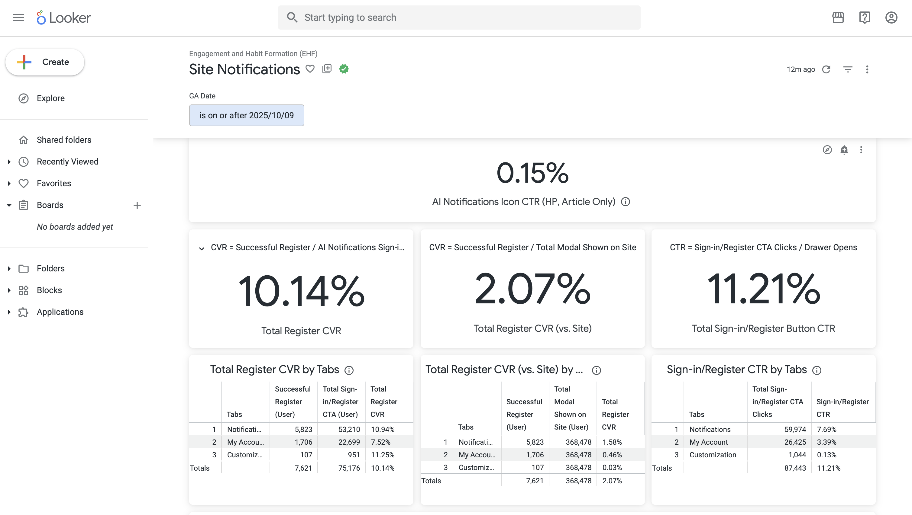
Notifications stats.
Design & Discovery
From a product perspective, we also wanted notifications to act as a lever that boosts a user's pageviews/per session to increase ad revenue opportunities.
This conundrum presented a design challenge.
UI Conundrum
Do we front-load actions or keep it subtle; prioritizing scannability?
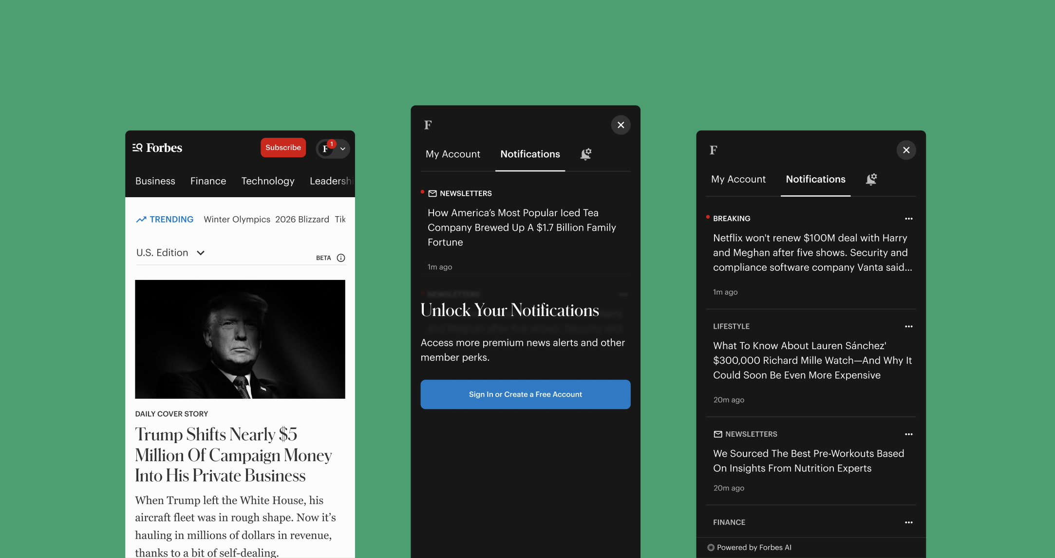
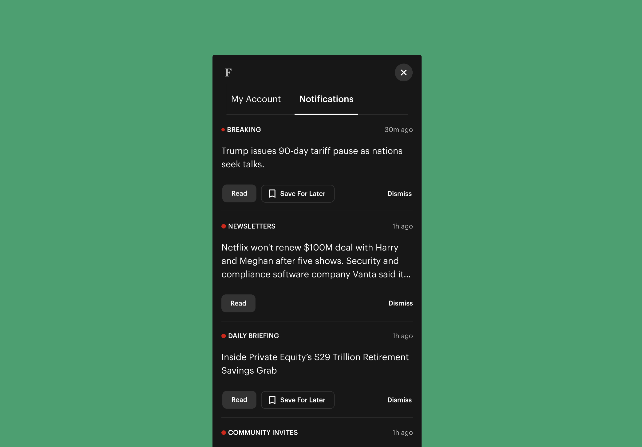
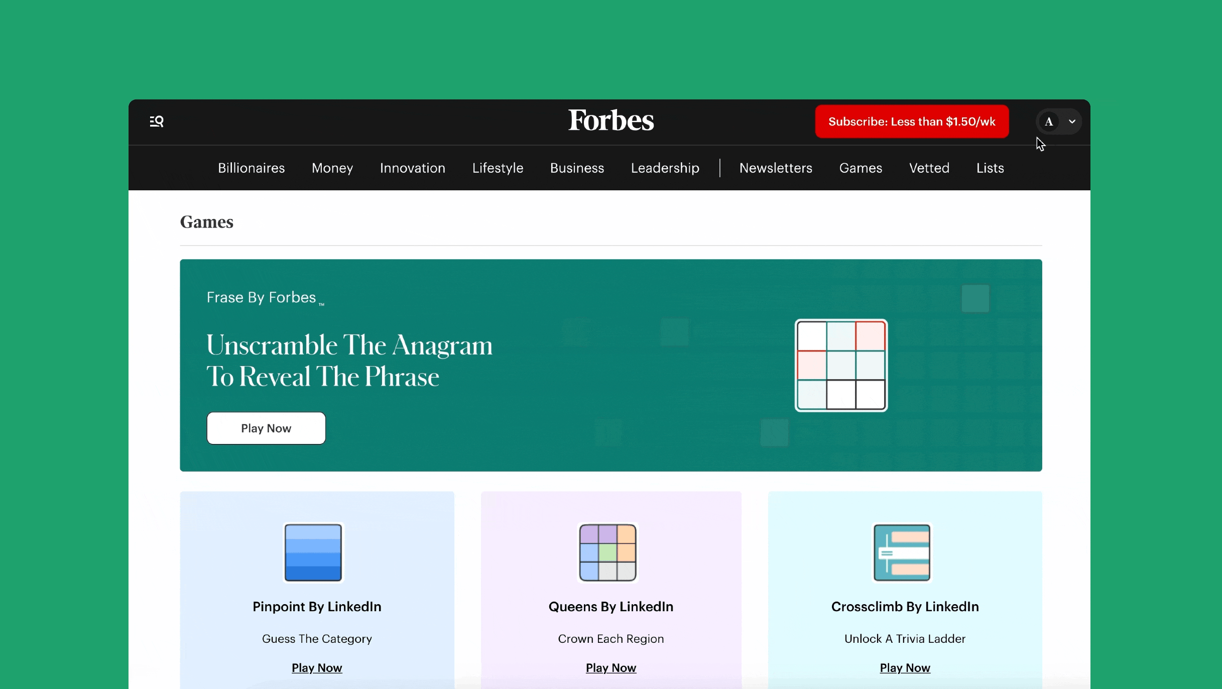
Action Forward UI vs Content Forward UI
L to R: Content Forward UI, Mixed UI, Action Forward UI
- Content Forward UI: Prioritizes content over actions.
- Mixed UI: Depending on the context of the notification, it may prioritize actions or content. This is typically seen in apps like LinkedIn or Instagram.
- Action Forward UI: Prioritizes action/urgency over content; typically seen in apps like Venmo.
Internally, We Favored Content Forward UI, Here's Why:
Maintaining Editorial Integrity
Action-forward UI works when the product’s primary value is execution meanwhile, content-forward UI works when the product’s primary value is judgment.
While action-forward notification patterns work well for utility and social products, we chose a content-first approach for Forbes.
Editorially, notifications at Forbes should be an evaluative surface. Despite pushback from product, we optimized for scanning and relevancy-based signals over an action forward UI.
How Might We Statement
Now that a notification pattern was settled on, this north star statement was created to re-align us back to the goal of this project.
How might we create high conversion pathways that encourage account creation within the anonymous user flow before they churn?
Finding Our Value Proposition
With help from editorial, we were able to formulate two themes as our value proposition to anonymous users.
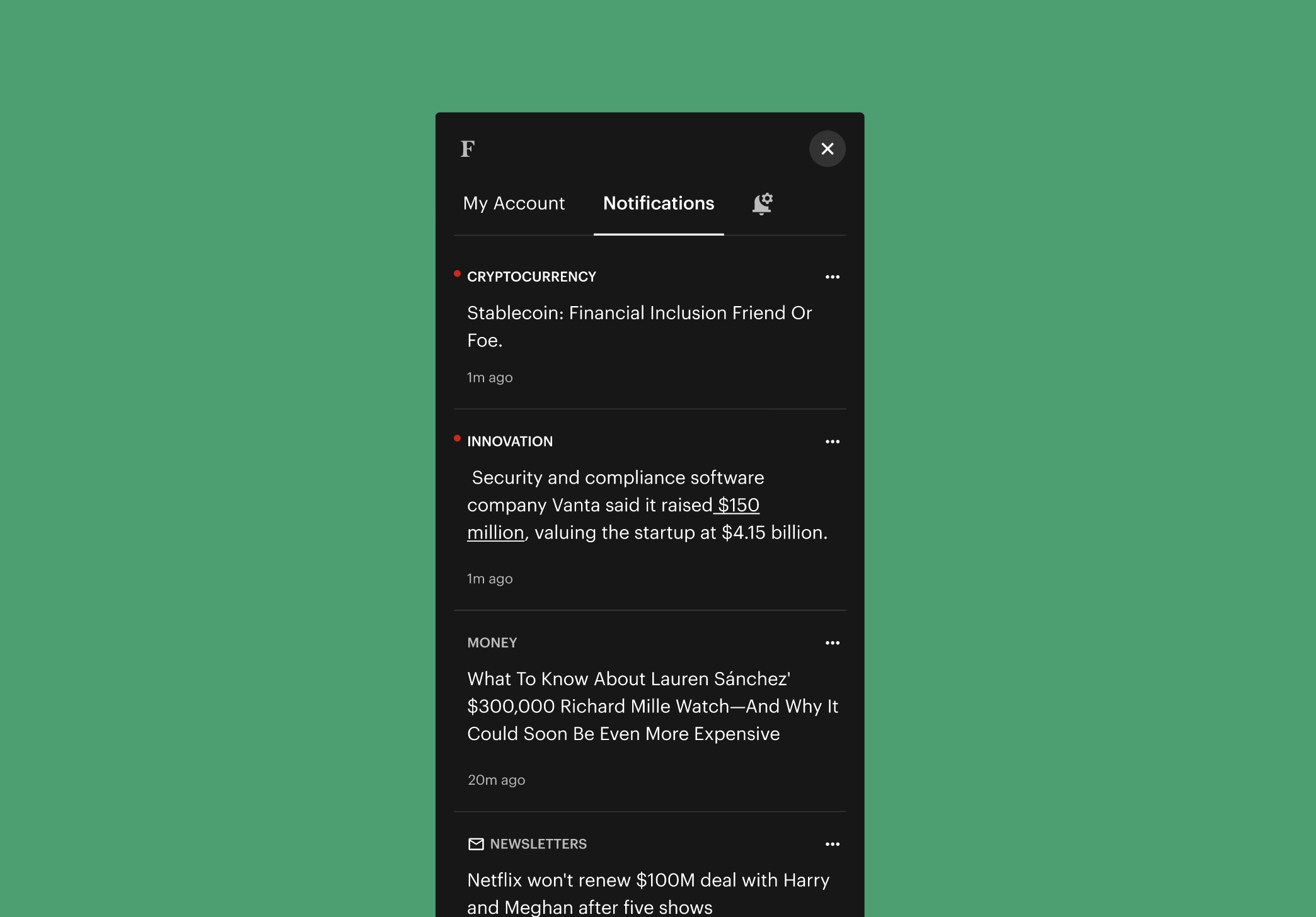
Ongoing Utility
We shaped notifications to be alerts that provide ongoing utility in the sense that, it's a proactive way to find news you care about, without having to browse for it. The justification for this utility was only signing up for a free account to unlock it.
Personal Relevance / Identity
We also shaped personalization to be a key selling point; letting readers know, we respect their attention and only wanted to notify them about topics they cared about.
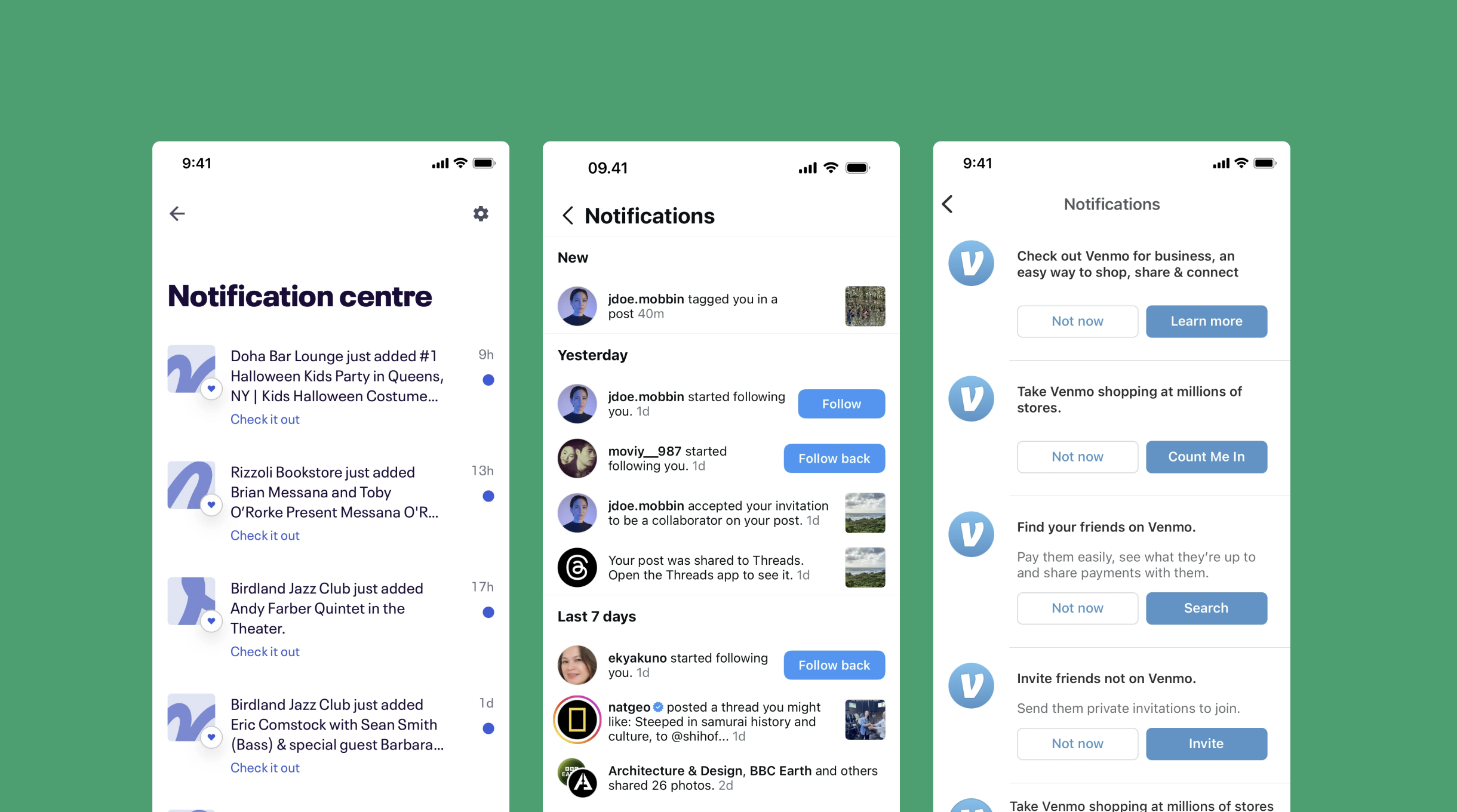
The Solution
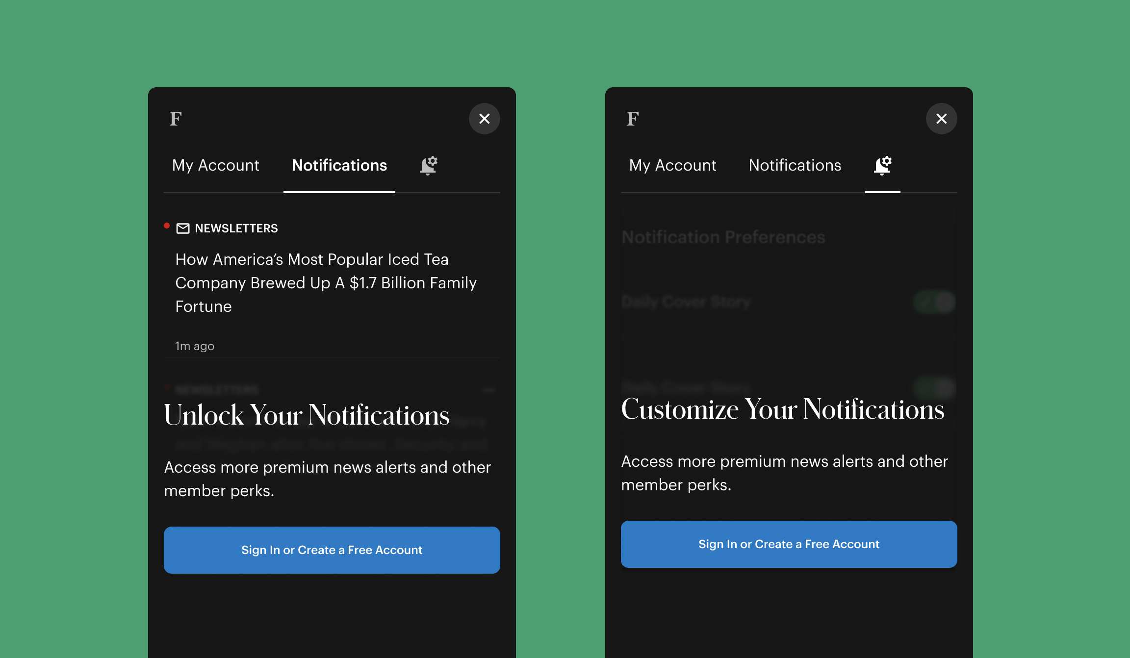
A Personalized Ongoing Utility Behind A Freemium Account
To be honest, the creative direction for this part was led by our PM 😅. They had a hunch that blurring parts of the notifiication's UI and locking its benefits behind a free account gate would incentivize users to create a free account.
I felt obliged to see their vision through; good to know their hunch was right.
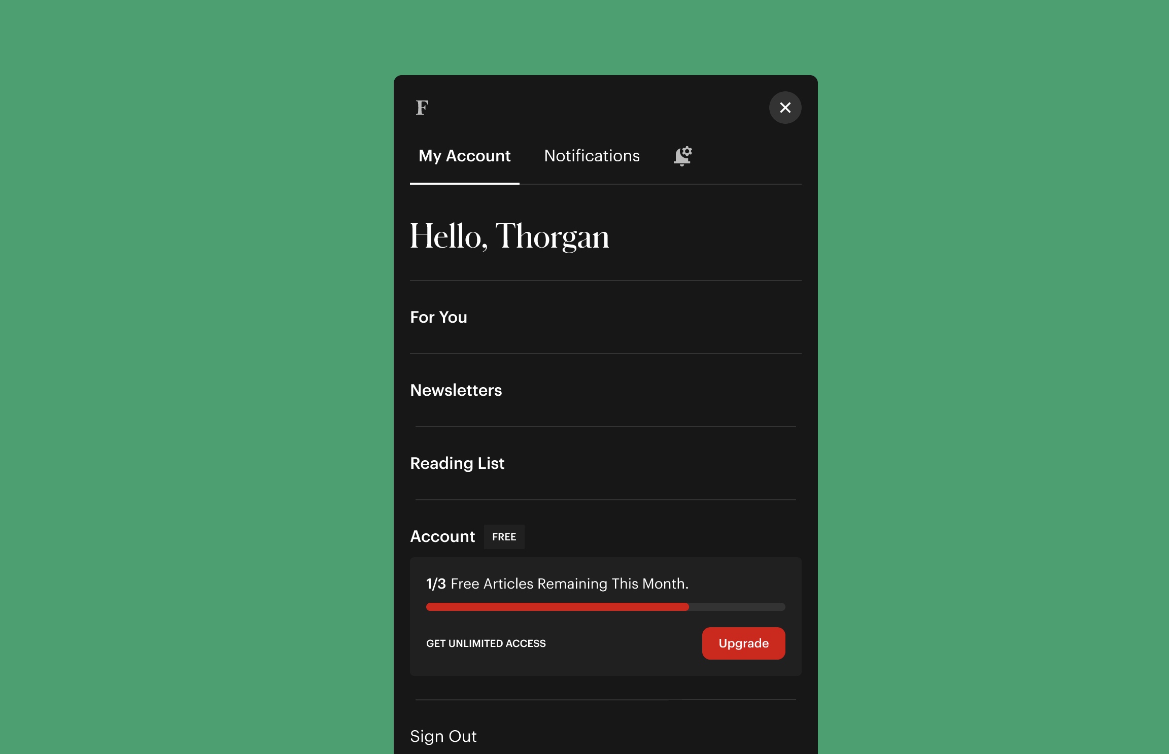
So An Anonymous User Has Created a Free Account, Now What?
As a serial free trial user 🙃, I was all too aware of the "nudge effect" similar upgrade modules have on freemium users, especially when they can see their utilization of their freemium account; this was the impetus for the ugrade module.
I pitched this module to the team and it got immediate buy-in. Unfortunately, with the way we track user activity, this module was not able to be implemented as intended.
Easter Eggs
A Little Personalization For The Win
To keep things light and fun, we added a little personalization to the notifications' component. The indicator, takes the first letter of the user's name and once clicked, and on the account tab, they get a nice "Hello, userName" greeting to hopefully brighten up their day. Go check it out!
Lessons Learned: Why This Experience Mattered
This was an enthralling experience; acting as a liaison between editorial and product counterparts to find the right balance between user acquisition and editorial integrity is an experience I will never forget.
The project reinforced the idea of knowing what kind of product you own, and how best to represent that through your product's design; a valuable lesson I will carry with me in future projects.
Ultimately, this was an interesting project to see through. It's always fascinating to see how introducing
something so simple like an account wall behind a utility feature can have a significant impact on users' willingness to create an account.
Bertie: SEO Sidekick & Assistant
Every superhero needs a sidekick; making SEO auditing more engaging and informative for Forbes' journalists.
View Case Study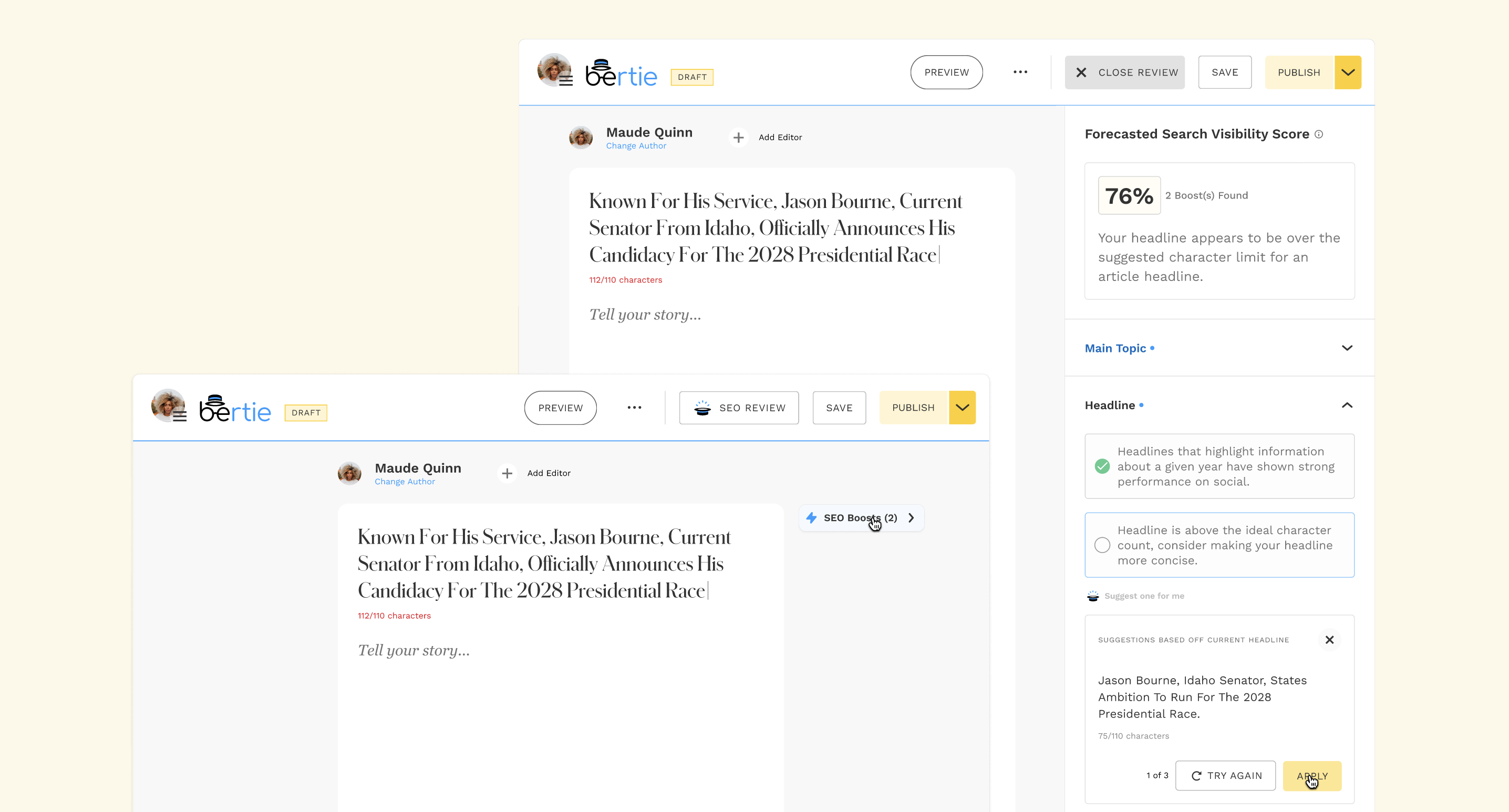
Get In Touch
© | Adé Obayomi